
You are provided with data in a format that specifically reflects a particular analysis, and you are instructed to use that data to view the analysis from a different angle. Then you notice that the supplied format does not simply support that other perspective, because the data is not structured in the appropriate way…
Anyone who has worked in a “data analyst” position for a while will undoubtedly recognize this situation.
That's why I developed a tutorial on how to improve the structure of a data table, to allow for more flexible analysis and visualization. The intention is to do this “transformation” of the table as efficiently as possible, namely by combining the built-in functionalities of Excel and limiting manual interventions.
This tutorial starts from an example, which is prepared as a “report” rather than a data table, and which tries to provide an insight into the educational situation of Belgians and other nationalities in our country depending on age and residence (source data from the national census in 2012 ).
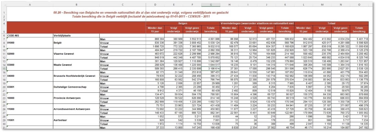
In this table we see many characteristics that make flexible analysis impossible. For example, there are a lot of merged cells, rows and columns containing (sub)totals are mixed with other rows and columns, and the available “dimensions” (fields) are rigidly defined for one angle of the base file.
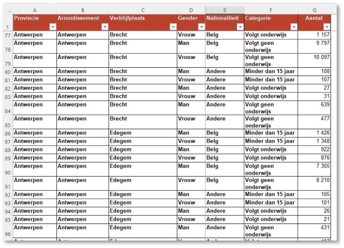
What we want is a table with a more suitable structure, without redundant (calculable) subtotals and with an optimized number of dimensions.
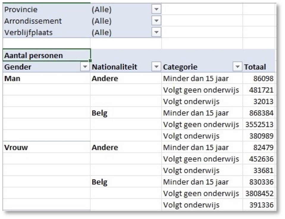
After all, you can easily create a pivot table from such a structure…
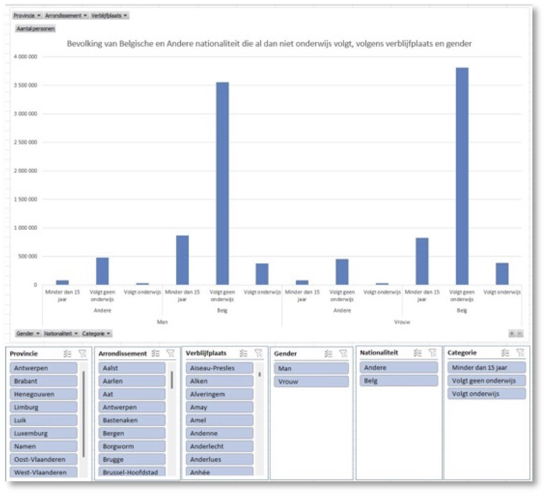
… or a pivot chart with Slicers so that you can change angles and analyze scenarios to your heart's content.
You start by figuring out a path to get from “point A to point B”. In this lesson, this results in a 15-step plan in which you perform the conversion with only 7 Excel functions and a handful of other Excel techniques.
The detailed plan is applicable in ALL currently supported Excel versions. Things may be even more efficient in the most recent version, but the concepts (and the “10 commandments” of a good data table) remain the same.
The transformation of the more than 30,000 data in the report into a table that allows flexible analysis and visualizations (e.g. pivot tables and graphs) is possible in just half an hour…
At the bottom of this article you will find a PDF with the written step-by-step plan (available in Dutch and English version).
Three practice files are available for download(click HERE to download them):
- The original source file
- A file with the 15 steps explained in separate worksheets
- The final data file (barely larger in storage space, but much more useful for analysis)
Applying these principles can have a profound effect on the amount of time and work you put into data analytics.